For the last week or two, I’ve been using a neat little app called Snap Swipe Drawer. What this app does, is create a duplicate notification shade, that pulls down to show widgets. In my short time spent with the app, it turns out that I really like it (so much for a review that starts with that, huh?).
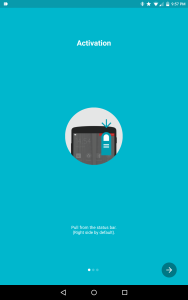
One of the initial setup screens
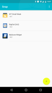
How the widgets are listed, within the app
Once I insalled it, I was taken to a simple setup screen. It contained three slides, with the final one indicating that I was finished The first of the other two show how to open/activate the shade, and the remaining one showed how to adjust the sizes of the widgets. The usage of the app is simple, so there’s no serious need for instructions beyond the two, basic slides. Once that slide show is finished, I was off and running. The “home screen” for the app is fairly blank, with a plus button in the lower right hand corner, and the three dotted option indicator in the top right, to round out the look; activating that opens up the menu with a toggle for whether or not the app should be running at all, Preferences, and Upgrade. For those interested in upgrading, the cost of $1.85 nets a user unlimited widgets (the free version is capped at three) and the removal of ads / “buy incentives” (which isn’t clarified); I have as of yet to see any ads within the app, though I fully expect them at some point and take that as a warning.
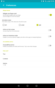
The app’s options
In the preferences, there are a couple of handy features. Not many, mind you, but less is more here. There’s a toggle at the top of the preferences for users to enable one finger scrolling. With this disabled, any scrollable widgets require two fingers to operate, as the single finger swiping will raise or lower Snap’s widget shade.; the converse (and default setting) is that one finger will activate the widgets, and only when swiping along the app’s periphery will it return Snap’s shade to the top. Below that, uses can choose where they would like their desired area to be the app’s “hotspot” for activation. When users swipe downward from the designated area (left, right, or center of the top of the screen, regardless of orientation), an identical looking notification bar is superimposed, and mimics the same behavior of the conventional/stock notification shade.
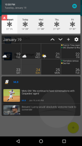
What my Snap drawer currently looks like
This allows me to activate the stock shade where I’d like, and also actiavate Snap’s where I’d like, using the same gesture for both, just in different areas. While disabled by default, there are two more toggles for the user: lock screen activation and activation during immersive mode; either can be enabled should the user desire Lastly, there’s a toggle that jumps the user over to the page for Accessibility, where it promises the following:
1. Smoother App Transitions
2. Apps will not pause while the Snap drawer is opened.
3 Snap will not respond to the back button while accessibility is enabled.
I enabled this and never looked back.
Setting up a widget is similar to placing one on the home screen, and just as simple. Users tap on the plus button to view their list of widgets. Once the desired widget is selected (and calibrated, if need be), users will choose the size; widgets are typically best at 4 wide, as it nicely fits the width of the screen, and length is more negotiable. That being said, users can go as little as 1 column wide, and anywhere from 1 to five rows long. Once completed, the widget shows up on the otherwise blank homescreen. That’s it. Pick your widget, its size, and you’re done. You can swipe down from the designated area to see your widget there, waiting to be viewed or interacted with. Should you ever feel the need to re-size the widget, simply tap on it from within Snap, on it’s homescreen. Once you have multiple widgets in that list (and in the shade, by extension), they can be managed from this home screen. Long pressing on one of them allows a users to move it higher or lower in the app, which is then reflected instantly in Snap’s shade. Removal is just as simple, where I merely swiped the widget listed within the app, in either direction where it was instantly removed. And this is the place were I have to lodge one of my complaints with the app. Neither of these features were listed or explained anywhere with in the app. Reordering and removing widgets is a fairly important function, and in the first few days I deleted apps and re-added apps in order to adjust what order they were in, as it took some (later) guesswork on my part to figure out how to edit the widgets. Considering how this is pretty close to core, I would urge the developer to add some sort of flag to get the attention of the user on this point.
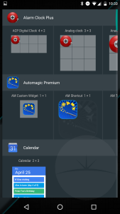
Stock Android list of widgets
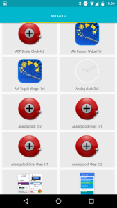
Snap’s widget list
My other complaint was how the list of widgets looked. On the left, you see how clear the widgets are listed for Google’s Launcher. On the right, you see Snap’s list of the same, yet the graphics don’t seem quite up to par, not awful mind you, but there’s still a noticeable difference. While the importance of the graphics of the icons in this list is a far cry from the aforementioned widget re-ordering and deleting, it would enhance the app’s fit and finish.
I’m currently running three widgets in mine, and they all perform nicely, and without any lag. The app is lightweight, both in storage, ringing in a little under 9 MB, as well as in RAM, at only 43MB. So for the back end, this app hums along nicely without chocking up resources, and performs nicely when I’m using it. And its performance is matched by its utility, and that’s really how this app shines for me. It has allowed me to “hide” widgets that I see no point in staring at all day, yet I can access it on demand, from anywhere in my phone. My calendar and weather forecast were just begging to be used this way. I don’t need to check the week’s forecast every time I hit my home screen, but now I can access it just as easily, on the occasion I want to; same goes for my calendar. Move these here has created a new “problem” for me to solve as well… what to do with my homescreen? So while I’m recommending this app, even the paid version, I’m hoping some of the readers can throw a recommendation or two my way for something to take the place of my newly-hidden staple widgets. What to do with my new found screen real estate?
https://play.google.com/store/apps/details?id=com.fb.iwidget
